Showing posts sorted by relevance for query big wall cabinet. Sort by date Show all posts

Saturday, April 15, 2017

A Small Bathroom That Feels Big

Read article : A Small Bathroom That Feels Big

The small bath problem and proposed solutions

A Small Bathroom That Feels Big

Lead photo

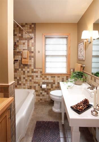
Bathroom after remodeling

The kitchen may be the heart of the home, but over the past 20 years, the bathroom has morphed into the home's soul—a savored refuge from our busy world. Once little more than utilitarian space, the bath has expanded, both in size and in role, to serve as a pleasing retreat.

How to create such a retreat in an ordinary, compact 5 x 9-ft. bathroom could easily leave the owner feeling like a, well, lost soul. Remodeling a bath built to accommodate a standard 5-ft. tub, a toilet and a vanity without adding footage can be a challenge.

Just ask Pam Peterson, who wanted to mine more space from her small 1954 bathroom. She turned to designer Matthew Rain of Abode Drafting, who, along with the remodelers at Mike Otto Construction, “grew” her limited space without changing the room's footprint and added modern elegance to a dated room.

Their solution relied on several fixes: reconfiguring the linen closet; brightening up the fixtures; updating the wall, tile and floor surfaces; and radically changing the vanity.

The Bathroom, Before and After

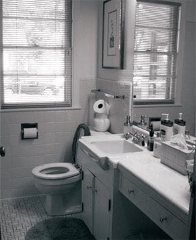
An oversized vanity and solid-color harvest gold tile visually shrank this already small bathroom.

With the installation of bright fixtures and right-sized pieces, this bathroom gains a big-time feel.

Black and white beforeBathroom before remodeling

Fewer doors, more space

A Small Bathroom That Feels Big

More storage, fewer swinging doors

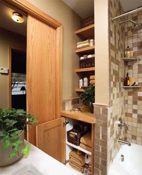
This corner is now functional storage with an open look and feel. Eliminating most of the cabinet doors and adding a pocket door created a greater sense of space.

Rain cleaned up the structural clutter by rethinking the original linen closet. It had four cabinet doors in the bathroom and another access door from the hallway. “With all those cabinet doors and the big bathroom door, I felt I was always dodging and weaving anytime I needed to get something,” says Peterson of the old layout. “Some door was always in the way.”

The new design turned a bad closet into a great one by shedding all but one of the bathroom cabinet doors and removing the hallway cabinetry entirely. “The new wall space in the hall allowed us to turn the old bathroom door into a pocket door. Eliminating a door 'in-swing' immediately gives a room a bigger feel,” says Rain.

The new bathroom storage area has five custom open shelves made of red oak (to match the room's new light-toned trim), perfect for stacks of towels (photo). “By leaving these shelves open, it also adds to the room's feeling of spaciousness,” says Rain, “and because you can quickly grab a towel, it's functional as well.”

Tiled for a big feel

A Small Bathroom That Feels Big

Mixed tile colors

The rough edges and rich colors of the tile create the illusion of natural stone, but in reality, it's low-maintenance porcelain. Because the mosaic style breaks up the color pattern, the eye perceives that the room is larger.

Despite the recent interest in retro fashion, there is little nostalgia for the old harvest gold look. In this bathroom, the wall and floor surfaces were replaced with an easy-to-clean porcelain tile in a palette of warm colors—including gold.

While the mosaic tile is beautiful, it also serves a design purpose. “Both the scale of the 2-inch tile and the random arrangement give the feeling of being in a larger room,” says Rain. He found 2-in. tile that could be ordered in a random mix, which took the guesswork out of how much of each tile color to purchase for a mosaic (photo). “The dark floor tiles in a larger format, here a 6-by-6, also add to the spaciousness,” Rain says.

Bright, clean and open for small spaces

A Small Bathroom That Feels Big

Photo 1: Open sink console

To accent the open space underneath the console vanity, a polished chrome finish P-trap was used.

A Small Bathroom That Feels Big

Photo 2: New faucet and a refinished tub

The brushed nickel finish was selected for its long wear and because “it simply doesn't show dirt as much,” says designer Matthew Rain. The bathtub was refinished so it would match the clean white color of the new fixtures.

Peterson wanted a crisp look that wasn't overly modern. “I didn't want anything too elaborate in this little bath. It's hard to appreciate things in such a small room because there is no place to stand back and take it in,” she says. “I wanted a look with simple lines.”

Rain selected nearly all of the fixtures and accessories from Kohler's Memoirs collection. “The style matched up well with my client's tastes and the products were 'right-sized' for the scale of the room,” says Rain, adding that shopping online saved him and his client hours of legwork.

After 50 years of use, the tub was beginning to show its age. Replacement wasn't feasible without either special ordering an expensive custom bathtub to fit the constraints of the room or undertaking a more extensive remodel. “Because it's a high-quality cast-iron tub, I decided to spend $500 to refinish it,” says Peterson (Photo 2). “It looks good and saved money in demolition and installation costs.”

Warranties on tub refinishing vary but usually hover around the five-year mark. “I've found that a refinished tub will last about seven years when it's used every day or around 10 with low use,” says remodeler Mike Otto.

The old vanity was dated and with its clunky style took up too much space in the small bath. A contemporary console sink with square legs was used as a replacement with eye-popping results (Photo 1). The console style offers enough space to place toiletries by the basin but without the chunkiness of a traditional vanity.

“This is probably one of the biggest changes in the room when it comes to opening things up,” says Peterson. “I had wanted some unique pieces in the room and this is definitely one of them.”

Wednesday, March 7, 2018

A Small Bathroom That Feels Big

Read article : A Small Bathroom That Feels Big

The small bath problem and proposed solutions

A Small Bathroom That Feels Big

Lead photo

Bathroom after remodeling

The kitchen may be the heart of the home, but over the past 20 years, the bathroom has morphed into the home's soul—a savored refuge from our busy world. Once little more than utilitarian space, the bath has expanded, both in size and in role, to serve as a pleasing retreat.

How to create such a retreat in an ordinary, compact 5 x 9-ft. bathroom could easily leave the owner feeling like a, well, lost soul. Remodeling a bath built to accommodate a standard 5-ft. tub, a toilet and a vanity without adding footage can be a challenge.

Just ask Pam Peterson, who wanted to mine more space from her small 1954 bathroom. She turned to designer Matthew Rain of Abode Drafting, who, along with the remodelers at Mike Otto Construction, “grew” her limited space without changing the room's footprint and added modern elegance to a dated room.

Their solution relied on several fixes: reconfiguring the linen closet; brightening up the fixtures; updating the wall, tile and floor surfaces; and radically changing the vanity.

The Bathroom, Before and After

An oversized vanity and solid-color harvest gold tile visually shrank this already small bathroom.

With the installation of bright fixtures and right-sized pieces, this bathroom gains a big-time feel.

Black and white beforeBathroom before remodeling

Fewer doors, more space

A Small Bathroom That Feels Big

More storage, fewer swinging doors

This corner is now functional storage with an open look and feel. Eliminating most of the cabinet doors and adding a pocket door created a greater sense of space.

Rain cleaned up the structural clutter by rethinking the original linen closet. It had four cabinet doors in the bathroom and another access door from the hallway. “With all those cabinet doors and the big bathroom door, I felt I was always dodging and weaving anytime I needed to get something,” says Peterson of the old layout. “Some door was always in the way.”

The new design turned a bad closet into a great one by shedding all but one of the bathroom cabinet doors and removing the hallway cabinetry entirely. “The new wall space in the hall allowed us to turn the old bathroom door into a pocket door. Eliminating a door 'in-swing' immediately gives a room a bigger feel,” says Rain.

The new bathroom storage area has five custom open shelves made of red oak (to match the room's new light-toned trim), perfect for stacks of towels (photo). “By leaving these shelves open, it also adds to the room's feeling of spaciousness,” says Rain, “and because you can quickly grab a towel, it's functional as well.”

Tiled for a big feel

A Small Bathroom That Feels Big

Mixed tile colors

The rough edges and rich colors of the tile create the illusion of natural stone, but in reality, it's low-maintenance porcelain. Because the mosaic style breaks up the color pattern, the eye perceives that the room is larger.

Despite the recent interest in retro fashion, there is little nostalgia for the old harvest gold look. In this bathroom, the wall and floor surfaces were replaced with an easy-to-clean porcelain tile in a palette of warm colors—including gold.

While the mosaic tile is beautiful, it also serves a design purpose. “Both the scale of the 2-inch tile and the random arrangement give the feeling of being in a larger room,” says Rain. He found 2-in. tile that could be ordered in a random mix, which took the guesswork out of how much of each tile color to purchase for a mosaic (photo). “The dark floor tiles in a larger format, here a 6-by-6, also add to the spaciousness,” Rain says.

Bright, clean and open for small spaces

A Small Bathroom That Feels Big

Photo 1: Open sink console

To accent the open space underneath the console vanity, a polished chrome finish P-trap was used.

A Small Bathroom That Feels Big

Photo 2: New faucet and a refinished tub

The brushed nickel finish was selected for its long wear and because “it simply doesn't show dirt as much,” says designer Matthew Rain. The bathtub was refinished so it would match the clean white color of the new fixtures.

Peterson wanted a crisp look that wasn't overly modern. “I didn't want anything too elaborate in this little bath. It's hard to appreciate things in such a small room because there is no place to stand back and take it in,” she says. “I wanted a look with simple lines.”

Rain selected nearly all of the fixtures and accessories from Kohler's Memoirs collection. “The style matched up well with my client's tastes and the products were 'right-sized' for the scale of the room,” says Rain, adding that shopping online saved him and his client hours of legwork.

After 50 years of use, the tub was beginning to show its age. Replacement wasn't feasible without either special ordering an expensive custom bathtub to fit the constraints of the room or undertaking a more extensive remodel. “Because it's a high-quality cast-iron tub, I decided to spend $500 to refinish it,” says Peterson (Photo 2). “It looks good and saved money in demolition and installation costs.”

Warranties on tub refinishing vary but usually hover around the five-year mark. “I've found that a refinished tub will last about seven years when it's used every day or around 10 with low use,” says remodeler Mike Otto.

The old vanity was dated and with its clunky style took up too much space in the small bath. A contemporary console sink with square legs was used as a replacement with eye-popping results (Photo 1). The console style offers enough space to place toiletries by the basin but without the chunkiness of a traditional vanity.

“This is probably one of the biggest changes in the room when it comes to opening things up,” says Peterson. “I had wanted some unique pieces in the room and this is definitely one of them.”

Tuesday, March 28, 2017

6 clever ways to make space in a small bathroom

Read article : 6 clever ways to make space in a small bathroom

Most Popular

Use these design, layout and storage ideas to make the most of a small bathroom.

1. MAKE A PLAN

Start by making a floorplan sketch of the room, noting the length of each wall, the position of the door, which side it opens on and any windows. Then make a scale plan on squared paper, cutting out paper shapes to represent the fittings. There are also online 3D planners you can use; try Ideal Standard. Rerouting the hot and cold water supplies to where they are needed shouldn't be problematic, but the waste pipe from the WC needs a short, straight run to an outside wall to join the soil stack. If that's not possible, fitting a macerator and pump allows a small bore pipe to be used, so you have more flexibility in positioning the WC. Don't forget to allow enough clearance around bathroom fittings so you can move around easily. As a rough guide, you need 70cm in front of a WC and basin and 100cm in front of a bath.

Advertisement - Continue Reading Below

2. CONSIDER DESIGN SOLUTIONS

There's no reason a small space can't be big on design. Be inspired by the latest wall-hung fittings, introduce luxe finishes for walls and floors, and add sparkle with chrome and glass. Choosing a statement piece of furniture or a bold basin will help create a focal point. When refitting an existing bathroom, there isn't always room to move fittings, but space-saving compact versions can make all the difference. Also consider underfloor heating instead of a radiator to free up more space. If your ideas aren't working, think outside the box and investigate whether moving a wall or window or simply changing the way a door hangs could free up space.

Most Popular

3. SELECT A SPACE-SAVING BATH

If you love a good soak, don't be denied this pleasure because your room is too small for a bath – there are several models at a compact 1,500mm x 700mm, while the Gem from Bathroom Heaven comes in lengths of just 1,200mm or 1,300mm. Squeezing in a roll-top bath might even be possible – some are designed with squared-off sides to fit neatly into a corner. Or consider a slipper bath; they tend to be deep but short. Rather than having a separate shower, a shower bath, which gets wider at one end to accommodate room to shower, is a good option. These L- or P-shaped baths come with bespoke screens to keep the water in and some are just 1,500mm long.

4. OPT FOR A SHOWER

Made-to-measure screens, £1,900 including fitting; HSK Renodeco shower panel in Limestone, from £295 for a 900mm x 2,550mm panel; all Frontline Bathrooms

Particularly in an extra bathroom such as a loft room or ensuite, a bath is not so necessary and a shower room will make better use of limited space. Enclosures with bi-fold, pivot or sliding doors are space solvers, as are pentangle or quadrant enclosures that nestle into a corner. Or consider a wet-room design without an enclosure, but with a fixed panel to prevent the whole room getting splashed.

5. PICK A PETITE BASIN AND LOO

Many basins and WCs are wall hung – a huge advantage in a tiny room since they don't eat into the floor space so the room appears larger. 'Short projection' basins and WCs and those designed to fit into a corner are other good solutions for space-starved rooms. Cloakroom basins and some 'quadrant' or corner basins can be tiny – good for rinsing your hands, but not ideal for washing your face without splashing. Opting for a single monobloc tap simplifies the basin design, more so if you select a handleless one that turns on and off via a sensor.

6. FIND FURNITURE TO FIT

High cabinet with two doors, £95; mirror cabinet, £50; washbasin cabinet, £115; storage bench, £40; all Silveran collection, Ikea

Fitted, modular or freestanding furniture? It's down to personal taste, though the current trend is to get everything off the floor, including cabinetry. Fitted solutions are tailored to the room for maximum space efficiency. Look out for reduced 21cm depth furniture designed for smaller rooms. Modular storage is a good halfway house, consisting of units in set sizes that you can combine for a personal look. Taking a leaf from kitchen manufacturers, bathroom designers have come up with clever drawers that fit around a basin, and deep drawers with shallower ones nestling inside. Streamline the look with push-close doors instead of handles.

Keep up-to-date with our inspiring ideas, latest looks, real-life homes and expert advice by signing up for our FREE newsletter…

Monday, June 19, 2017

Brilliant bathroom makeovers on a budget

Read article : Brilliant bathroom makeovers on a budget

Monday, February 12, 2018

Part 5: Making room for our home’s hiding places

Read article : Part 5: Making room for our home’s hiding places

As we put the finishing touches on the plans for our home, our dreams of dinner parties in the finished open kitchen, of repurposed original sconces and refurbished original details, gave way to a less sexy obsession. The mop, the vacuum, our winter coats, the laundry. Specifically: Where would they all go and how could we banish them from sight?

In the New York prewar apartments we’d lived in for years, closets were strictly optional and washer-dryers were nonexistent. What made glossy interior photos appealing, I came to realize, was what you didn’t see, because it was tucked into a hidden closet or built-in cabinet. Renovating our house gave us a shot at discreet convenience.

Entering the first-floor apartment, pre-renovation, meant coming face-to-face with a faux-wood-grained cabinet door—in actuality, a false front. It was an arguably clever way to bump out the bathroom on the other side to make room for a turquoise jacuzzi-shaped tub. Otto’s initial plan for the enlarged bathroom included a non-aqua, 6-foot tub. But what we really wanted was an entryway closet. With a standard 5-foot tub, we gained a proper foyer and a narrow coat closet on the other side of the wall.

First-floor square footage was valuable, but we admitted to ourselves we would be much likelier to stay on top of the wash if it were integrated into kitchen chores and didn’t involve trekking up and down stairs. So Otto designed a new pantry/washer-dryer closet in the kitchen with an automatic light and stacking electric Miele washer-dryer. The same closet, which my partner later fitted with an Ikea Norberg table and some Elfa wire shelves, would also hold cleaning supplies and dog food.

The closets pre-renovation.
The laundry pantry in progress.

One of our favorite ideas from Otto: Since our ceilings are 10 feet high, he suggested additional closet doors above both the entryway closet and pantry. The mini-closet above the pantry alone would provide an additional 15 square feet of storage. Our contractor, CNS, priced out the additional closet framing and custom doors at a very reasonable $600.

We could have added traditional closets to the bedroom. But we wanted to keep the non-utility rooms flexible, in case we add to our family or otherwise change how we used the house. The windowless room between the living room and bedroom would make a perfect walk-through closet.

Using left-behind plastic garment racks upstairs convinced me that I did not want open storage. Open storage is for the preternaturally tidy, which I am not, and I wanted seamlessness and harmony. Generally, getting to “seamless” means custom cabinetry. Otto estimated a wall of built-in clothes closets with nice doors could run around $6,000. Or we could hack some Ikea for less than a third of that.

The Ikea PAX wardrobe boxes in the closet area.Devon Banks

We thought we’d left Ikea behind with our futon days. But that was before we had a designer who knew how to use its modular components precisely, or how to hack cabinet frames with custom doors. For the storage that was really going to put in the work, the old blue-and-yellow big box was it. With Otto’s help, we were soon on a first-name basis with the Ikea catalog.

Naturally, there are no short trips to Ikea. Not with the cavernous dimensions, the waits for returns, and the inescapable, interminable “full-service” pickup. It frayed domestic relations. “I feel so basic getting into a fight on the Ikea line,” said my partner, as we traded apologies on what felt like our 50th visit. By then, paying the impressively responsive Perfect Assembly $50 to $149 to shop and deliver from a New Jersey Ikea seemed worth every penny. (They also will put it together for you for a reasonable fee.)

We got lucky with Ikea’s ubiquitous PAX wardrobe boxes: three PAX frames in a row (small, medium, and large widths) just fit the walk-through closet space when bolted to the wall—no fill-in molding required. But my partner disdained the PAX doors: They were cheap-looking without even being that cheap.

Enter Semihandmade,* which makes a variety of doors for PAX frames that start at just $40 more a door than Ikea’s Hemnes doors, though you have to factor in production times and shipping from California.

We were trying to be disciplined about the finishes, sticking to neutrals knowing that color variation would come later with removable items like rugs and art. We sought to limit the number of wood tones we chose, settling on matte white oak (the same wood as the original staircase and the one we chose for the floors) and a darker walnut and mahogany. We promptly fell in love with Semihandmade’s flat-sawn walnut doors, which fit the moodier, cocoon-like feel we were going for in the bedroom suite.

The completed and stocked laundry pantry in the kitchen. Devon Banks

We wanted a similar aesthetic consistency on all the house’s hardware: Almost everything new would be either antique brass to match the house’s original hardware, including the snakelike exterior door handle, or a more transitional matte black. (For the uninitiated, “transitional” is what bath and hardware manufacturers came up with to describe fittings that aren’t sleekly modern or fussily traditional, but streamlined enough to fit in with either decor.) For the closet doors, we picked inexpensive brass tab pulls whose clean lines didn’t compete with the beautiful walnut grain.

For the walls, we tried to be strict about sticking to white and three shades of gray, one of which, the blue-green-gray Night Train, we used in a glossier exterior finish (called Grand Entrance) that would only be found in the outer vestibule and door. We went with Benjamin Moore—already Otto’s go-to paint brand—who generously provided product.** After at least a dozen sample pots, we settled on Brushed Aluminum, the ideal ambiguous, warmer sage gray for key moldings and our foyer.

To hide television cords, we went back to Semihandmade for a $20 wall-mounted Besta frame topped with a DIY slab door ($44). Late one night when the contractors were gone, we painted the Besta door the same white we’d chosen for the living room and dining room, Benjamin Moore’s Snowfall White, in the hope it would simply recede into the wall. We added a matte-black handle from Atlas Homewares I’d ordered on Amazon as a sample for the kitchen.

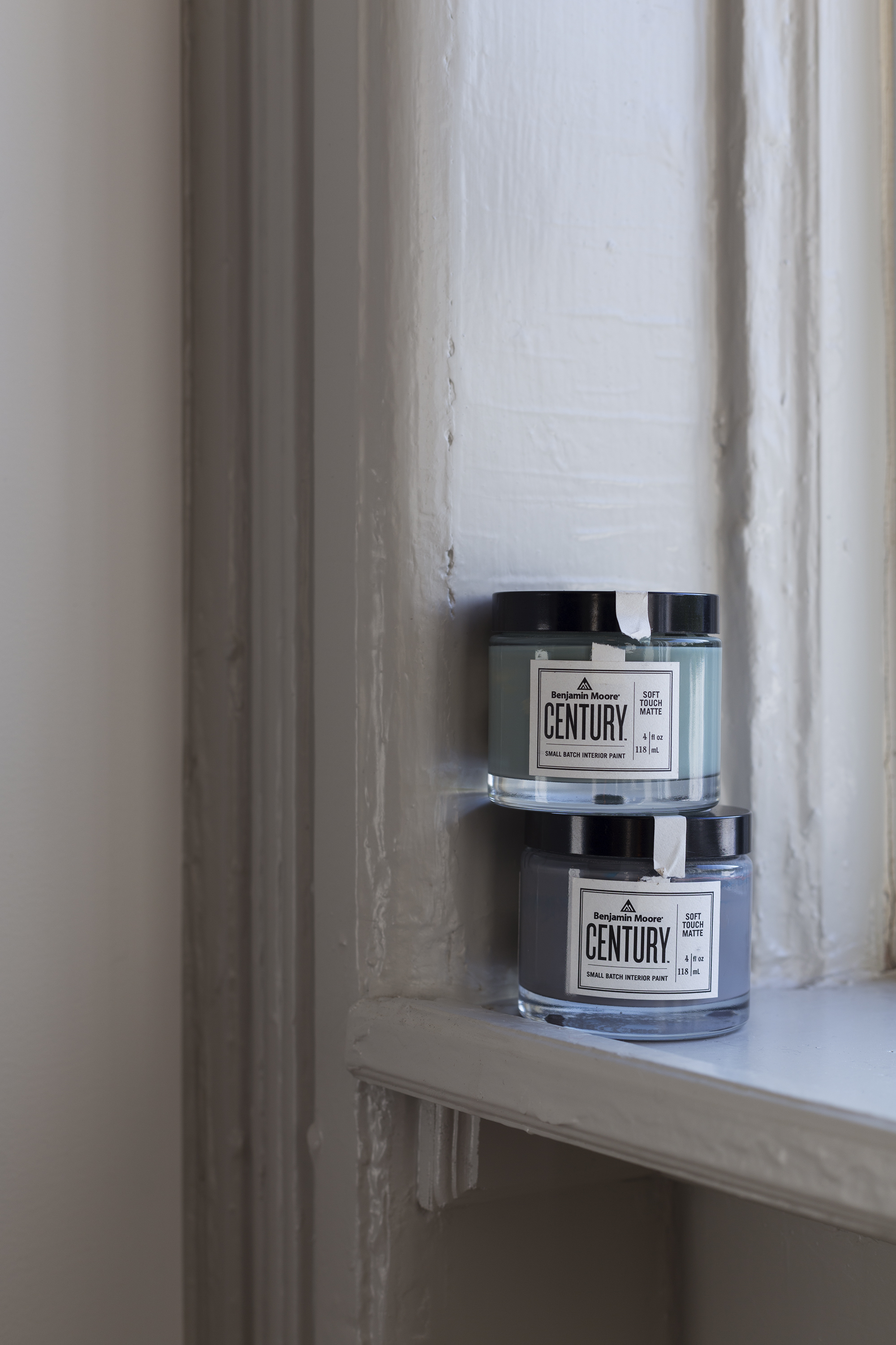
New to Benjamin Moore is the velvety Century line. Unlike the bajillion colors available in Moore’s other paint lines, Century is a much smaller selection of highly saturated colors—intriguing but intimidating—that have to be seen in person to be understood. My partner was averse to truly dark colors, so my love for dark teal would be limited to the office. After spending time with all the emerald tones, I picked Light Beryl.

For the bedroom area—both walk-through closet and bedroom—we chose Marcasite, which would also visually separate it from the sunny white of the more public rooms of the house.

Another cheap trick to attain the visual smoothness of built-ins: Painting Ikea Tarva furniture, made of unfinished pine, with the same Marcasite paint and then upgrading the hardware. It took all freaking night, what with two disassembled dressers and two nightstands, but in the end, we would have our “built-in” furniture at a fraction of the price.

*Semihandmade partnered with the homeowners on this project; they received a 50 percent discount on cabinet fronts.

**This project is sponsored in part by Benjamin Moore, who provided the Century paint.

Next week, onRenovation Diary:

Our intrepid homeowner finds out what happens when you try to carry slabs of marble on your own—and a peek at the finished bathroom.

Thursday, May 11, 2017

Create A Bright, Spacious Feel In A Small Bathroom -- Big Bathroom Shop

Read article : Create A Bright, Spacious Feel In A Small Bathroom -- Big Bathroom Shop

Small bathrooms can be transformed into warm and inviting spaces where you can truly unwind and relax and with close attention to detail and careful planning you can easily create your dream bathroom.

Small Bathroom

Small Bathroom

Sept. 9, 2011 - PRLog -- Small bathrooms can be transformed into warm and inviting spaces where you can truly unwind and relax. Planning and creating a new bathroom suite can be a challenging experience especially if you have a small bathroom, but by paying attention to detail and carefully planning how you want the room to look and feel you can easily achieve your dream bathroom.

Small bathrooms can be turned into your very own bathing sanctuary, providing you plan carefully. Before choosing any new products for your bathroom make sure that you accurately measure the space and double check your measurements as every little bit counts! Small bathrooms usually only have enough space to install either a bath or a shower enclosure so decide which is more important to you, do you prefer to shower or bathe? Quadrant shower enclosures are an ideal choice for small bathrooms as they are designed to maximise the floor space and take up less room than standard square designs. Walk in showers are great for small bathrooms too and will provide you with a spacious showering area and will add a touch of designer style to the bathroom as well as creating a sense of space.

Having a small bathroom doesn't mean that you can't include a stylish bath in your design. There are a wide variety of compact baths suitable for small bathrooms measuring just 1500mm or 1600mm in length, they come in a range of styles including compact freestanding baths, straight acrylic or steel baths http://www.bigbathroomshop.co.uk/baths/steel-baths and compact shower baths so you can combine both bathing and showering in the same space.

Wall-mounted toilets http://www.bigbathroomshop.co.uk/pottery/toilets/wall-hun... and basins are the perfect solution for creating the illusion of more space in small bathrooms and will make cleaning the floor a whole lot easier too! There are more products around than ever before that are specifically designed for small bathrooms; these include toilets with short projections, corner basins and compact bathroom furniture designs.

Having somewhere to store your toiletries out of sight is a definite advantage for small bathrooms and will help you keep the room clutter free. If a small bathroom is full of clutter it will only make the room feel even smaller so make sure that you install some bathroom furniture such as a wall-mounted cabinet to help keep your small bathroom looking neat and streamlined.

The final details will make all the difference to your small bathroom. Consider installing a stylish heated towel rail http://www.bigbathroomshop.co.uk/furniture-and-accessorie... to provide you with the luxury of warm towels. A large bathroom mirror will reflect the lights and increase the feeling of space, you may think about opting for a mirror with lights to provide you with useful illumination and to create a striking feature too.

http://www.bigbathroomshop.co.uk/bathroom-suites/small-bathroom-suites

# # #

Big Bathroom Shop is the UK's leading bathroom retailer with the largest range of bathroom product online. With over 5000 quality bathroom products you can be sure you'll find the right product at the most competetive price.

Saturday, March 24, 2018

Specialty Bathrooms - Specialty Bathrooms

Read article : Specialty Bathrooms - Specialty Bathrooms

In addition to more baths, today's homes often sport more specialized baths than in the past. Easiest to create in newly constructed homes or additions, specialty baths can also be carved out of unused guest bedrooms, hallways, the space over the garage, or other existing areas. Here are a few of the most-wanted specialty baths.

Master Suite

While many homes can accommodate a master bath adjacent to the master bedroom, a master suite has the bathroom actually incorporated into a section of the overall bedroom area, both enclosed behind a door that leads to the common hallway.

Large or small, a master suite looks especially spacious and elegant when both the bedroom and the bathroom share a design scheme.

Although the bedroom is largely soft furnishings and the bathroom is mostly hard-surface installed fixtures, you can incorporate the same motifs (neoclassical, English country, Early American, soft contemporary, etc.) in both, using the same color scheme.

You may elect to alter the proportions of each color to create variations on a theme. For example, an opulent European-inspired bedroom in wine with accents of hunter green, gold, and ivory may lead nicely into a master bath with hunter green fixtures, brass-gold fittings, and ivory ceramic tiles, sparked with towels and accessories in wine.

When designing the suite, you may want to avoid putting fixtures on the wall shared with the bedroom to minimize noise from a pressure-assist toilet, shower, and so on. You can further buffer sound by putting bath cabinets and bedroom closets on opposite sides of a shared wall, with the bed on the far wall.

If possible, locate the bath on an outside wall to make a window possible, and make sure the walkway between the bedroom and the bath is easily accessible, wide enough, and free of obstructions, to be safe for users in the dark or when ill.

Private Toilet Compartment

With both halves of a couple rushing to get ready for work at the same time these days, a shared bathroom is under more demands. Even the closest pair often prefer a private toilet compartment, and bigger baths are beginning to reflect this desire.

Where your waste stack is (or can be) located will have a lot to do with where the toilet is located. If it's on a far wall and in a corner, a separate compartment is feasible. The compartment wall will run the full height of the room and should extend at least 3 feet in front of the toilet and a foot on each side; wider for universal accessibility.

The compartment should be equipped with an easily accessible artificial light source plus a skylight or small window if at all possible. If there's no operable window, be sure to install an exhaust fan to keep the space fresh. You'll also want to make sure that there's enough space for a hanging cabinet above the toilet tank to house commonly needed supplies and that there's room for a small wastebasket on the floor.

A pocket door makes privacy easier without sacrificing precious floor space.

If a totally private compartment isn't possible, look into designs that include a half-high partition that can be tiled the same as adjoining walls or a tall, hinged screen covered in fabric that coordinates with your room scheme. If the toilet is located in or near a corner, these solutions may be an acceptable compromise.

Exercise Room

You're going to jump into the shower right after you exercise anyway, right? So why not bring the exercise equipment to the bath area? That's the philosophy behind today's new exercise room baths.

If your space is big enough, it may be right for you. Plan to put all bathroom fixtures on perimeter walls, and offset the door to allow space for one or two pieces of exercise equipment in the free area. Make sure you're not blocking the door or access to bathroom fixtures: Measure the space required for normal use of all equipment, and give them plenty of berth. Specify nonslip floor tiles to guard against slipping due to perspiration and bathing, and plan systems for ample ventilation, too.

Laundry Room

While many laundry appliances have come out of the basement and up to the mud room or kitchen, others are being located near where dirty clothes first accumulate: the bedroom or bathroom. If you and your mate are alone in the house, you may want to put the laundry equipment in your master suite; if you share the house with children, you may prefer to house it in the kids' bathroom or a nearby guest bath.

Laundry appliances can tie into the same water supplies as the bathrooms, and preferred flooring -- nonporous, nonslip tile -- can be extended for both to create a neater look. If space is scanty, you may opt for a stacked washer/dryer unit, although these handle smaller loads than a typical family creates.

Allow for plenty of overhead storage, preferably enclosed, for laundry supplies as well as hampers or other storage for sorting clothes. A pocket or folding door easily conceals the whole works from the rest of the bath, but you may want access on both ends of the laundry space so that laundry facilities can be used without going through the main bathroom area.

Adjacent Closet

Closets between a bedroom and a bath make sense, and a dressing room area lined with roomy closets, all located next to a bath, is an even greater luxury you may want to consider. You might find part of the necessary space in a hallway closet, an unused area of the bedroom, or even a corner of the bath, provided they're contiguous.

This is one place where telling your architect, contractor, or designer what you want can really pay off. They'll be on the lookout for ways to shoehorn extra closets into even a tiny space for you. Once the basic space is in, consult a professional closet design firm, or explore the closet fittings section of your local home store for ways to maximize the closet space you have. You'll surely find ideas that work in the rest of your closets, too!

There are a few tried and true configurations for bathrooms. On the next page, find out more about basic bathroom layouts.

To learn more about decorating or remodeling your bathroom, visit:

Thursday, December 21, 2017

The World's Most Beautiful Voyage - Hurtigruten Review

Read article : The World's Most Beautiful Voyage - Hurtigruten Review
The world's most beautiful voyage is how the Hurtigruten cruise line bills the coastal voyage from Bergen to Kirkenes. They are so right! We were on the Midnatsol the same time as karoggra who posted a review titled, Best scenic cruise in the world. The voyage is rarely on open sea so you have scenery on both sides of the ship most of the trip.

My husband and I were traveling on a tour arranged by travel agency so we had a pickup from our hotel to the dock. We arrived about 6 p.m. after an all day Norway in a Nutshell® tour. Check-in took seconds and we boarded with our carry-on bags. The cabin cards were handed to us as we entered the covered walkway to deck 6. The deck 6 entrance is only used at Bergen. Our bags were waiting at the entrance to our cabin. Since we were doing a round-trip and started at the home port, baggage handling was done by the ship crew.

Ship: We had an starboard outside cabin on deck 4. It was 2 cabins away from the atrium where the More elevators are located. All the traffic on and off the ship on the voyage takes place on deck 4 by the elevators so it was very handy. The ship has its own gangway which opens up on the side of the side. Stand on deck 5 and watch the gangway open sometime. It is very interesting.

There are two other openings in the side of the ship further down for cargo and cars. The ship doesn't have to rely on port gangways which take time. The ship is very efficient getting in and out of ports. Some stops were for only 15 minutes. I learned how they did that visiting the bridge.

The cargo hold is designed for pallets so the forklift trucks would be whipping around on the dock unloading or loading. At Stamsund, we had over an hour stay so while we were out walking around the village, the forklift operators were unloading mattresses and building supplies.

There is another elevator near the back of the ship serving decks 4 - 8. It is handy for those in the stern of the ship. Public restrooms are available near the dining room on deck 5 and near the main elevators on deck 5 and 8. There is a conference area on deck 5 which is used for presentations or conferences. It is not an entertainment venue. We did have three slide presentations on the ship: The Royal Family, National Day and National Costumes. We are onboard for National Day, May 17. There was a parade around deck 9 with flags, banners, and national costumes.

Cabin: Our cabin was very functional. We had a cabin with one twin bed under the window and one perpendicular to it. The bed under the window made into a sofa during the day. The beds are hard but still comfortable. The covers are duvets with a quilted liner. It was too hot for me so I just used the sheet. There was one extra pillow in the room and we asked for another. There are two wool blankets to use on the outside decks. Yes, we needed the blanket when lounging topside some days.

You receive one bath towel and one hand towel to start. If you want a clean towel, leave it on the floor. There are no washcloths. I bought a few with me. There is a mounted container of hand soap/shampoo by the sink and in the shower area. To save room packing, I used Twitter @HurtigrutenASA to find out that there was a dryer in the bathroom. There is.

The cabin has desk area with small mirrored cubbies on either size of the big mirror. There is a plug by the mirror which we used to charge the camera batteries and iPad. You will need a converter and adapter for the European style plug.

The hanging closet had two sections (his and hers) with 5 hangers in each section. The clothes hang front to back rather than side by side. There were two sections of shelving in the main closet and two more big shelves by the desk. The suitcases fit under the bed.

The bathroom was very functional and I liked it better than some of the US market ships I have been on. There is a step up to the bathroom. There is a small step down to the shower. It is designed to have an angle to allow more room. The curtain is long enough to keep the water in the shower area. The shower head can be kept mounted on the pole or used as a hand-held. There is a retractable clothes line. The floor can be heated with the switch on the wall outside the bathroom. There is a big wall cabinet with shelves for all your toiletries. I still had space in it after stowing everything. There is a towel bar by the sink with wall mounted cup holders.

I found out that the inside cabins do have TV as well as the suites. No TV in the outside cabins. It was not missed. The telephone has some radio stations that you can listen to.

There are 4 washing machines on deck 4 close to the rear elevator. You purchase a token from reception and they give you the soap. The dryer is free. There are posted instructions in English. The machines are labelled in Norwegian. We did two loads for about $10.

What to do: If you take the round trip cruise you will receive a 130-page book with colored photos and an explanation of what you will see broken down by days. It is a great resource to read about what you are seeing along the way. The Tour Director does make announcements as described in three languages, English is always the second one. She gave us a heads up to what scenic wonder was coming our way so we could get to observation lounges or the correct side of the ship. You can turn off the announcements on the phone in your cabin.

As mentioned, there are many lounges without any waiters to bother you about drinks. If you want a drink, you go to the bar and get it yourself. There was a tray for self-busing of cups and glasses in most lounges.

We liked the forward lounges on deck 8 and 9 and the library on deck 8. The library has games and some English language books left by passengers. The deck 8 and 9 lounges have windows on three sides so you had a great view of the scenery. Deck 9 lounge is actually open to deck 8 lounge. It does get a little warm up there so we preferred deck 8.

Deck 9 had three major sections, the inside lounge, the outside deck with glass walls to protect from the wind and the back deck. We liked to lounge in the back. The chairs are not loungers so if you want to put your feet up, use another chair.

There are many teak round tables and matching chairs near the doorway on deck 9. The smokers were usually in this area.

Food: I was more impressed with the food than other reviewers. The food presentation at dinner was very impressive. Two chef teams took over the buffet area (in the center of the room) to dish up the food. One did the sauce, one plated the entree and sides and another added the garnishes. We received a booklet with the menus for the trip so we knew what night we would have the reindeer or the salmon. I am not a great fish eater but I did enjoy the meals.

Granted the breakfast and lunch buffets didn't vary much but they had a different hot breakfast item daily and hot lunch items. I discovered the hot oatmeal and added dried fruit and granola stuff to it. There was soft and hardboiled eggs very morning. I liked the whole grain breads. They did have a breakfast pasty item each day. They had a 6-slice toaster if you wanted toast. We learned to grab juice and water from the machine and stake out a table for the open seating breakfast. Than we headed to the buffet to stock up. Keep in mind the buffet is designed for the European market so expect cheese and cold cuts on the breakfast menu. Where else can you have cottage cheese and herring for breakfast. My husband was delighted with the 4-5 cheese selections at breakfast and lunch. He reports that they were mostly soft, all delicious, but no cheddar.

You won't find tacos, pizza, or hamburgers on the menu. If you want french fries, go to the snack bar and pay for them. The soups were excellent. I like smooth cream soups and these were excellent. Who knew asparagus soup could taste so good. The desserts were good and don't miss out on the slab ice cream at lunch. I didn't discover that until day 4!

Coffee: The coffee came out of one of the machines where you press a button and you get a cup of coffee. It is strong! I would have a cup with breakfast and than take another cup out to the lounge. Coffee was not provided at the table for dinner. The coffee machine is located on deck 8 by the bar. After dinner you go for coffee. If you want coffee between meals, you pay 25 KOR ($3.85) for a cup. They do have a coffee plan which is good for an entire year! You pay 209 KOR ($32.20 at this time) for a red metal lined mug which allows you to get coffee or tea for the trip. If you were a commuter and traveled frequently, it would be a good deal. We opted not to do that and were fine with the free coffee after meals.

Water: Although there are signs on the dining room table for purified water for 19 KOR, we found out that you just ask for tap water and they bring a carafe of water (no ice) to the table. They do that at lunch and dinner. I brought my own water bottle with me which I refilled from the bathroom sink. The water is nice and cold and tastes like bottled water.

Tours: We went on the following excursions: (Northbound) Trondheim Folk Museum, Tromsø City Tour (Polaria and Arctic Cathedral), and (Southbound) Tromsø Midnight Concert [the ship arrives at 11:45 p.m.], Lofoten Islands countryside tour, Trondheim City Tour (includes Nidaros Cathedral). We might have gone on more tours but they are not cheap. My husband says, the Folk Museum could have been skipped.

I did the Bridge Tour to see the Captain and the Bridge on day 11. I found it very interesting and worthwhile. That is posted in the daily program.

Shopping: The gift shop on board has a very nice selection of Norwegian products. We ended up doing most of our souvenir shopping on board. There is a nice gift shop at the Polar Bear Club in Hammerfest right by the dock. By the way the public library is across the street and has free wi-fi. There is a nice gift shop and ice bar in HonningsvĂĄg close to the dock.

Internet Access: There are 4 computers on deck 8 by the library. There is a 40 KOR ($6.22) charge per hour of use. I used my iPad and iTouch with the wireless that is available in the public areas. It is satellite so the reception is dependent upon a good signal so don't expect much when in the fjords or when there are mountain ranges on both sides of the ship. The mountains do impact reception. Deck 8 or 9 is the best. There is no coverage in the cabins and deck 5 is not as strong as deck 8. Thanks to the purser who helped me get the wi-fi started on my new iPad.

Staff: The staff are great. All are Norwegian and most switch effortlessly from Norwegian to English to German. The staff work 22 days on and then 22 days off including the captain. We did see some new faces over the course of the cruise. There is not a culture of tipping so we didn't have to worry about an add on for tips like most cruises. There is a big wooden bowl by the head waiter's desk at the entrance to the dining room. There is a small sign that it is for TIPS with Thank You in several languages. We left the rest of our Norwegian money in the tip bowl.

The staff are helpful, have a ready smile, are efficient but are not fawning. Since the Hurtigruten line does ferry and cargo service besides us tourists, they have some systems that are not the same as a regular cruise line. What you won't see: no towel animals, no nightly program in your room, (pick it up in the announcement area on deck 8), no turn down service, no free between meal snacks, no singers and dancers (singer and keyboard in the lounge deck 8 in the evening), and no rah rah cruise director. What you will find is a comfortable trip in the midst of spectacular scenery with plenty of time to relax and read or look out the window.

As Americans, we were in the minority. The prominent groups were Norwegian and German. The weather was good for most of the trip. The last few days were overcast with clouds hiding the mountain tops. We had clear skies for a good part of the trip and enjoyed the midnight sun. Less

Saturday, August 12, 2017

Renovate a 1950s Bathroom | Family Handyman

Read article : Renovate a 1950s Bathroom | Family Handyman

Big splash, low budget

Some say that if you wait long enough, Everything—including 1950s bathrooms— comes back in style. But “in style” doesn't necessarily mean “in perfect shape” or “in sync with today's lifestyle.” Such was the case with the bathroom shown here. Moisture problems had caused peeling paint and sticking vanity drawers, while 50 years of wear and tear had taken a toll on the grout, fixtures and hardware. However, the owners, Mary Jane and Bruce Pappas, saw too many things going for the space to completely gut it, such as unique tile work that was still in excellent shape.

“The whole point of buying this fifties house was to create our 21st century life here while honoring the original architecture and detail,” says Mary Jane, who is a professional interior designer. “Bruce and I wanted to complement and elevate what was already here and reuse as many materials as we could.” And by doing so, they were able to reach their goal of updated function on a modest budget. The couple were able to avoid expensive demolition work and get the bathroom they wanted for just under $5,000. “The results for the investment are extraordinary,” says Mary Jane Pappas.

Updated, But Still Original

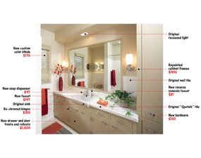
This bathroom now has greater utility and a clean, contemporary look— without breaking the bank.

Updated bathroomUpdated bathroom

ReDO, reuse, recycle

Renovate a 1950s Bathroom

Vintage tile

The vanity's vintage “Sputnik” tile pattern inspired the khaki color scheme of the bathroom and adjoining bedroom.

Renovate a 1950s Bathroom

New rollouts, old cabinet

The vanity cabinet is original, but for about $1,500, the new door and drawers were constructed with wipe-clean Melamine bottoms and maple sides decked out with metal slides.

Renovate a 1950s Bathroom

Updated storage closet

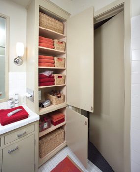
Adjustable shelving with Melamine surfaces was added along with a replacement tissue box holder. A hidden cabinet outlet keeps a hair dryer ready to roll and the electric toothbrushes charged.

After adding an exhaust fan to handle the moisture problem, they began dealing with the cosmetics, as explained by Mary Jane Pappas.

Freshening tiled surfaces
A professional tiler was brought in to repair the period tiles that had seen 53 years of bathroom life. By tuckpointing broken edges and freshening the grout, the tiler brought the surfaces up to standard. “The tile is unique to the era; we embraced the retro feel of it. It was in great shape and worth saving.”

Vanity drawers and doors
Another great example of the couple's “reuse it” philosophy lies in their treatment of the vanity. Years of water damage had made the drawers difficult to open, but instead of scrapping the entire piece, the Pappases hired Thomas J. Ross of Ross Custom Cabinetry Inc. to build new rollout drawers and cabinet doors for it and adjustable shelving for the attached linen closet. “Before, the cabinet drawers were only simple wooden boxes resting in a wooden cabinet. It was a struggle to pull 'wood-on-wood' drawers, especially when they were damp. Now that they're equipped to glide on rollers, it's like having a new piece of furniture. And when you think of the floor, tile and drywall work that we would have incurred had we demolished and installed all new cabinetry, that decision saved thousands.”

Paint, pulls and hinges
The vanity face-lift continued with several coats of an enamel paint and re-chromed hinges and the addition of contemporary drawer pulls. “We re-chromed the hinges because the plates had a unique screw pattern and I didn't want to add any additional screw holes to the vanity and risk the old holes showing.” The original mirror was saved by painting its trim the same color as the vanity.

Sink faucet
The Pappases wanted to add a soap pump and a water filter to their bath sink. By changing the old, widespread faucet for a single-lever faucet, they were able to avoid the expense of either buying a new sink or drilling new holes. The change in style left two unused holes for the new accessories.

Lighting
The old sconces were replaced with lights that better match the new drawer pulls and add a contemporary flair to the room.

Keepers! The '50s heat fan and tissue dispenser
The couple wanted to maintain the items that, like the heat fan, were still stylishly serving a useful function in the bathroom. “It's a nice amenity and it still worked, so why get rid of that?” They were even able to save the original metal tissue dispenser housed in the linen cabinet. It could no longer hold tissue boxes because the dispenser slot was vertical instead of the modern horizontal style. “But the same company, Brobick, now offers a replacement dispenser that fits tissue boxes perfectly.”

The tub
Replacing a bathtub affects the tile surrounding it, the walls above it and the plumbing below it. Keeping the existing tub saves tremendous time and money. So the tub stayed put, while some of the more easily changed elements around it were replaced. One of the first changes was to oust the shower door. “In a small bathroom, a flexible shower curtain creates a sense of spaciousness. And I use my bathtub every day, so a shower door is just not practical,” Pappas says. The original tub had a single showerhead with a bathtub faucet. Now a low-cradled hand shower, perfect for tub bathers, easily sets into an adjustable height showerhead fixture, adding to the usefulness and elegance of the bathroom.

Simple details make the difference

Renovate a 1950s Bathroom

Custom blind

Instead of settling for an off-white window blind in the bathroom, Pappas used a window blind company to create a custom window treatment to match the wall color. (Small rooms appear even smaller with a different color window treatment.) “For $175, getting an exact color match is a great deal,” says Pappas.

Renovate a 1950s Bathroom

Towels and rugs

The towels and bathroom rug proved to be a shopping challenge. “I wanted to find rich colors to work with the khaki walls and the cabinetry. I found high-quality towels I love from an online store, but searched and searched for a matching rug that would stand up to a wet environment. Finally I had a custom one handmade to match,” says Pappas.

Renovate a 1950s Bathroom

Shower curtain pull

A last little splurge of elegance lies in the Kravet silk tassel shower curtain pull ($75). Costing half as much as the Restoration Hardware shower curtain itself, the tassel adds a touch of luxury to this otherwise thrifty remodel.

Having saved a bundle by retrofitting many existing systems in the bathroom, the Pappases had some budget left to indulge in a few accessories.

Friday, January 12, 2018

Dream Camper Floor Plan Contest

Read article : Dream Camper Floor Plan Contest

Dream Camper Floor Plan Contest – Part 2 http://www.truckcampermagazine.com/news/dream-camper-floor-plan-contest-part-2/"> Dream Camper Floor Plan Contest – Part 2&BODY=I found this article interesting and thought of sharing it with you. Check it out: http://www.truckcampermagazine.com/news/dream-camper-floor-plan-contest-part-2/"> 12 more reader submitted dream floor plans including raw concepts, wild ideas, and subtle refinements.  And the winner of the first ever dream truck camper floor plan contest is… floor-plan-contest-winner Just last week we visited a prominent truck camper manufacturer and the subject of our dream camper floor plan contest came up.  We talked with great excitement about the variety of ideas our readers were presenting, and encouraged them to study the plans when they debuted.  No, we didn’t give them a sneak peak.  It’s more fun to tease. None of the submitted designs, including mine, are anywhere near production ready.  That was never the intention or spirit of this contest, nor is it possible without delving into details like plumbing, electrical, and code compliance.

The true potential of this contest is to give truck camper users from around the United States, Canada, and the world the opportunity to directly inspire professional truck camper design teams.  You know, the folks responsible for the truck campers you see debut here on Truck Camper Magazine, at RV shows, and dealer lots?  This was your shot to show them your big idea, and possibly change the course of truck camper design history.

I know, crazy talk.  Then again, crazier things have happened.  I’m going to lobby the industry to take your designs and ideas seriously, as I do with our bi-annual truck camper survey coming up this fall.  Together, we will change the course of campers.

Far be it for us to determine who should win the best dream camper floor plan, except that’s exactly what we had to do.  This is, after all, a contest, and we are the big cheese, cheesette, and cheese-cat for this electron-only magazine.  After considerable review, and a tail gesture we interpreted as positive, we have a winner.

The winner of the first ever dream truck camper floor plan contest is…

Karl Pettitt, Elmhurst, Illinois – Winner

Camper-Floorplan-pettitt-slide-out

Above: Click to enlarge this floor plan and the others below to see them bigger.

Although I don’t currently own a truck camper, I would like to in the future.  I often think of what an ideal floor plan would be so this was a fun exercise.  I first did the layout in a program that was to scale.  The dimensions should be pretty accurate.

The floor length is 11-feet.  The total length is 19-feet, 9-inches.  The width is 8-feet.  It’s a single-slide, dry bath, flatbed model.

Although there are a few flatbed model campers on the market, I think there is a great deal of room for more.  Specifically, I think there is room for a larger model that takes full advantage of the ability to place the door anywhere.

To this end, I created a floor plan layout that places the door towards the front of the curb side of the camper.  This allows for greater flexibility in the placement of the bathroom, which I put across the entire rear of the camper.

The slide allows space for both a dinette and a small couch that can turn into a bed.  Placement of the kitchen towards the front, along with the heaviest components such as the fresh water tank, battery bank, and propane tanks, will help in keeping the center of gravity as close to the front as possible.

The placement of the entertainment center allows for viewing either on the main floor or the cabover.  There is overhead storage above the kitchen and couch that makes up for the lack of floor cabinets.  There is also ample windows allowing light in from either side of the camper as well as views.  I think this would make an ideal camper for a family with the potential to sleep up to six people without the use of a bunk.

#16 – David Miller, Branson, Missouri – Honorable Mention

camper-floor-plan-miller-non-slide

My camper is designed with the premise that the most important things about a truck camper use are (1) the nice, soft, queen bed for sleeping, and (2) the nice bathroom for showering; not a wet bath.

The dining aspect needs less emphasis because, typically, the meals are simple and small.  In most cases, weather dependent, we eat outside at the picnic table.  Thus there is no need for a large dining table.

There is also no need to accommodate guests for sleeping.  If the grandkids are camping with us, they will sleep in a tent outside.  The concept of having the table convert to a bed is unnecessary, and a waste of space for us.

The attached drawing is for a non-slide design to fit a full-size short bed pickup.  I figure this camper will hang over the back of a 6’6” truck bed by approximately 27-inches.

Here are the wonderful features of my perfect truck camper:

It has a dry bath and shower.  This is extremely important.

The dining area has been reduced in size to only seat two adults.  The table is curved and the back of the seat cushion is curved to give the feeling and seating of a corner booth in a restaurant.  The only slight difficulty is that the person who sits down first will have to slide in and cannot get back out until the other person stands up, but, that is just like a corner booth in a restaurant and won’t be too much of a hassle.

There is a closet on both sides of the bed in addition to the foot lockers.  The television is mounted above the table, on the wall of the dry shower.

As you can see, the bed and the dry shower get the most emphasis, and the dining facilities are minimized.  It’s the perfect camper for two adults who want to shower every day after a good nights sleep.

#17 – Jake Schultz, Washington – Honorable Mention

A Folding Camper for the Ford Ranger

This camper is designed to be less than 780 pounds to work within the payload limit of a Ford Ranger.  It’s also designed to be 64-inches wide, with a maximum travel height of 82-inches.  These dimensions allow the camper to fit into a standard 84-inch garage in the folded configuration.

The camper features a full stand-up heigh interior of 76-inches, as shown.  A sun-dome could be added for an additional three-inches of interior height.

The camper has a double-pivot folding hard wall roof and sides with an open and panoramic cabin.

The camper can be used in one of four configurations:

1. Wide open with magnificent panoramic views to the aft sides and back.

2. Open to the aft sides and back, with screen netting in place.

3. Polycarbonate window panels in place (inboard of netting) for inclement weather.

4. Window panels in place and privacy curtains on the interior.

There would be comfortable seating for two at the dinette with the cushions angled slightly inward to account for the wheel well.

The camper would feature a modified full-size bed available at all times.  There would be a 24-inch cabinet for hanging clothes under the foot of the bed.

To save weight, the roof would be built for structure and snow loads only, not to stand on. The floor would be to stand on only if the camper is on the ground or in the bed of the truck, again to save weight.

There would be no jack stands.  The camper is suspended from the owner’s home garage root trusses to remove and store.

There would be an ice chest under one seat and Porta-Potti under the other.  There would be no refrigeration systems or black water tank.

All systems are in one four-foot module along the right side for minimum weight and system run lengths.  The module contains the propane tank, propane heater, two-burner stove, sink, fresh water tank, grey water tank, battery, converter, inverter, and small item storage.

#18 – Mark Larson, Phoenix, Arizona – Honorable Mention

camper-floor-plan-larson-non-slide

This is my drawing for one of my dream campers.  Please excuse the poor scale on the toilet, lavatory, and kitchen sink.

I know this would be better as a flatbed model because of the side aisle going to the cabover and the location of the shower.  It could also be an above the bed rail model.  I’m with you wanting a camper with no slide outs.  You had a great design of your own.

#19 – Kari Miller, Branson, Missouri – Honorable Mention

camper-floor-plan-Kari-miller-non-slide

My truck camper is the best design ever.  Here are the great features:

1. There is actually a solid wall between the over cab bedroom and the rest of the camper.  This creates total privacy, similar to a fifth wheel with an isolated separate bedroom.

2. The step to the bedroom is offset so there is not direct line of sight into the private bedroom.

3. There is room at the foot of the queen-size bed to access the closet and a real two-drawer dresser, which is what is needed for storing clothes in a camper.

4. A narrow, but deep and tall closet is behind the refrigerator is accessed from the step.

5. Instead of wasting room on a full table top and a table that converts to an unnecessary bed, this camper has a bar top for dining.  The seating consists of two bar stools which can be clamped down for traveling.  People spend many hours sitting on a bar stool so, obviously, these would be comfortable.  Plus, for most eating situations, people will either sit outside at the picnic table, or go out to eat at a restaurant.  There is a big window over the bar top so it would be pleasant sitting.

6. There is a slide-out pantry between the bar top and the range

7. The bathroom has a dry shower, which is important.

8. This camper should fit in a full-size short-bed pickup.  There are no slides, and it is
hard-sided.

#20 – Mike Cianci, Loveland, Colorado

floor-plan-contest-cianci-non-slide

Here’s my plan.  It’s fairly basic.  I chose a wet bath because it’s easier to clean.  Put it in the forward section near the wardrobe with a privacy curtain so nobody has to see your business.  And it’s easier to keep the bed/bath/dressing area cleaner.

I chose wardrobes with shelves or drawers which is more practical than hanging closets.  Who is bringing their tux and ball gown while truck camping?  There are overhead bins throughout where practical.

There would be LED lights, two batteries on a movable tray, and a small solar setup.  Only simple shades are necessary; no cornice, or valance boxes around the windows.

There would be 12-volt and 110 AC throughout, two Fantastic fans – one in the bedroom and kitchen – and an air conditioner   There would be a full-size skylight/dome in the bath with a side wall exhaust vent.

The sofa could be a jack knife-style, or have storage underneath.  And it would have two pull-out tray tables mounted in or adjacent to the armrest.  Plus it would pivot for easy egress from the sofa while eating or using computer, similar to tray tables on airliners in first class.

The television would be on standard pivot for bedroom and living room viewing, and would recess in a cabinet above the slide out pantry.  The rear exit door would have a platform deck for easy entry/egress.

#21 – Kevin Pinassi, New York, New York

Floor-Plan-KevinP-1Floor-Plan-KevinP-2

#22 – John Wells, Hollidaysburg, Pennsylvania

camper-floor-plan-wells-slide-infloor-plan-wells-slide-out-version

My design is a modification of the Chalet Ascent S100F, a limited production model (six total!) that Chalet discontinued to pursue production of their more profitable double and triple-slide models.  We love ours because it is completely usable with the slide in or out.

It has huge floorspace when the slide is out for entertaining friends and for ladies to dress in Civil War hoops (don’t ask).  The front bath allows a full height pleated curtain immediately behind the dinette to be drawn across to create a dressing room with access to bath, bed, and wardrobe.

There are no appliances in the slide, minimizing slide-out weight, and wear and tear on electrical and gas connections while maximizing efficiency of the refrigerator.  While we love our camper, please allow me to debut … drum roll… The Wellspring S110F.

My modifications to Chalet’s original design are as follows:

There would be 10-inches of increased length in the main cabin.  On the slide-out side, this extra wall space at the junction of the overcab and cabin strengthens the exterior at the crucial front corner tie-down.  We have already noticed flexing at this point and have taken steps to greatly reinforce this important structural location.  On the kitchen side, this extra 10-inches allows an increase in much-needed counter space, as well as under and over cabinetry.

I would also add about four to five inches to the side-to-side width of the wet bath.  The wardrobe doors and bathroom door would still function even with the slide in.

Additionally, I’d add half-penguin cabinets to the night stands at either side of the bed in the nose of the overcab.  These units would be open-shelved on the sides, half-depth and about 3/4 height, with a small rail or lip on the shelves and top edge to keep books, phones, clock, etc from falling out during travel.

I’d also add a three drawer cabinet with open top shelf and top rail at the foot of the bed on the bathroom side.  I’ve avoided the side hampers as I feel they add significantly to the difficulty of changing the bedclothes, though they could be added quite easily as an option.

#23 – Bob Dold, Monson, Massachusetts

floor-plan-dold-non-slide

Attached is my submission for the dream floor plan contest.  It is based off an EarthRoamer layout modified with a fore/aft dinette and an undercover slide-out compressor refrigerator chest.  I chose the slide-out compressor fridge since they are more efficient than a three-way refrigerator, and it allows for additional counter space.

One of my favorite features of the EarthRoamer plan is how the closet and bathroom doors can be opened and secured to provide a changing area outside the wet bath with access to the closet.  The wet bath has a wooded floor grate to provide a cleaner surface for the bath when the shower isn’t being used.

Access to the toilet cassette is through the rear storage door which drops down and can be used as a counter when cooking outside.  Another door above the horizontal door to the left of the spare tire can be used to store chairs and other lighter items out of the weather.

I prefer the side entry design as it allows the entire back wall to be used for storage and it allows access to the camper from the curbside when parked without having to remove bikes/trailers from the back of the camper.

The pantry to the left of the closet would be a bank of drawers with a window air conditioner unit above to provide for cool air without the expense and height of a roof mounted unit.  The dinette would be a little under three feet wide and can convert to a single bed if needed.

Large awning windows on either side provide lots of light and views with storage cabinets above them (not shown).  The overcab queen bed runs north/south to allow for getting out of bed without having to climb over your significant other, and has windows on both sides along with a skylight/Fantastic fan for good ventilation while sleeping.

Another feature I don’t see included on many campers any more is a pass through.  I would like the ability to stealth camp and having the pass through allows one to enter and exit the camper without having to go outside.

#24 – Floyd Schotel, Williams Lake, British Columbia

floor-plan-schotelnon-slide-pop-up

I’ve been dreaming up my ideal truck camper for a little while now, so you’re design contest is a great opportunity to share my napkin sketches!

For fuel efficiency, handling, and stealthiness, my ideal truck camper would be a low profile pop-up design to fit a 6.5-foot bed, full-size pickup.

The camper body extends past the bumper, dropping down for a low step-in side door.  Inside steps lead to the floor height.  This way the back of the camper is open to mount bikes, fuel, spares etc.  Also, the side door is a natural access to the curb or side picnic area.

Most of the windows are in the soft sides of the pop-up.  That way the camper will be more secure when in the locked down position.  In fact, the camper may look more like a service truck than a camper when in travel mode.

I’d keep the camper as small and tight to the truck as possible.  To keep things simple, I can do without a toilet/black tank, but a collapsable shower would be nice.

This camper is designed for boondocking and overland excursions as well as urban stealth camping.  I love the idea of taking my bed and a hot shower with me in a compact camper for a road trip.  No need to stress about finding a hotel, and a meal can be fixed anywhere, pronto!

#25 – Glenn Yauney, Milwaukie, Oregon

floor-plan-yauney-slide-out

Here is an idea of a dream truck camper floor plan.   We started with the floor plan of a 1140 Arctic Fox.   We added a rear slide-out and side entry.

We would prefer a camper with both a rear and a side slide-out.  When towing a trailer, a rear door entry is awkward, thus we prefer a side entry into the camper rather than a rear entry design.   We added a large closet in the rear slide-out opposite the entry door for boots, outdoor clothes, etc.

Storage space is also at a premium, so I propose one that has both ample wardrobe closets and storage space equipped with larger drawers.  You can’t have too much storage space.

Exterior storage isn’t shown, but basement and exterior storage are also a must.

#26 – TJ and Kelly Kretschmar, Kansas City, Kansas

floor-plan-kretschmar-non-slide

I am a mechanical engineer and have the ability to convert .pdf’s to CAD.  The Unimog part of the drawing can be found in the technical manual from Mercedes Benz website.  I printed the drawing to .pdf, then converted it to CAD.  I then printed the drawing for the Pangea concept and converted the drawing to CAD.

The reason I choose to draw this concept in CAD was to see if it was physically possible to put a garage bay in an expedition vehicle, and to incorporate my own ideas into the same space that would fit on a Unimog chassis with a single rear axle.

I deleted the interior of the lower living area so I could insert my own concept.  The items that I used from the original GXV drawing are the exterior walls, entry door, cassette toilet, and spare tires.  The loft area and access stairway is also GXV’s design, only with one bed instead of the two indicated in their drawing.

I used the Unimog drawing to make sure the entry door, center of gravity, and departure angle were going to work with the design.

We like the Pangea Lifting roof on a Unimog concept, but wanted it to double as a toy hauler.  We put one bed in the loft area to give the dinette area a sense of a vaulted ceiling.  The unit can be used in the down position for extreme cold weather.  The garage door folds down allowing access to spare tires.  The ATV slide out is similar to a Tommy Lift gate.

The camper would be able to detach with its own hydraulic jacks and allow for the installation of a dump bed.

This, of course, is just a dream.  For now our 1994 Hallmark Ute and 2006 Nissan Titan will have to suffice.

Truck Camper Information